

Hello community!
I have been following this mod for quite some time now since its first announcement on modb till its first alpha release for rebellion.
Actually before rebellion you were the reason that made me buy entrenchment , just to try the mod.
On this topic I wont talk about bugs, balance issues and the way the game works -after all i am pretty sure people with a lot more experience than mine in this mod know what they are doing-.
On this topic I want to talk about an important factor to every video game that ever existed: aesthetics and art direction.
I completely understand what Unikraken wrote on modb,
This is a WIP and could change, also note that this mod is done by us who have a certain vision, that might not be your vision of the Halo universe. Please understand this as some of our decisions and gameplay will directly reflect that. Nothing personal, it's just that we're modding it and subsequently it will have our bias.
,and i agree with it.
But some things like the aesthetics and the graphic/artistic experience of the mod are global factors as all gamers want to play visually nice games.
Please take the following notes I made as a source of constructive feedback regarding that factor and not just as "s0me th1ngs that n00b doe3sn l1ke".
Please also forgive my English as I am still trying to learn them properly 
1) Everything is too dark; and that's a shame since the 3d models - ships and buildings - are literally stunning with all the detail when you zoom at them. But they look amazing only when you zoom at them, because when you play in a normal zoom you only see some dark silhouettes. You might say now that "the UNSC always had black spaceships!" but what about the covenant who have purple and in some times light purple. Currently at the mod they have a light-grey-purple colour which also happens to be desaturated.
Proposed solution:
Play with the tones, add more colour.
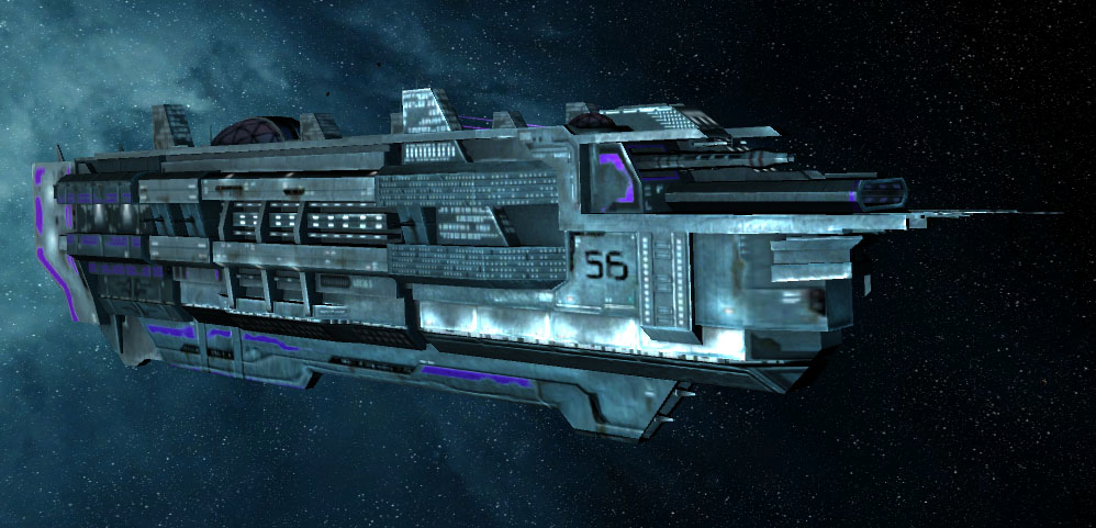
This Akkan Battlecruiser is 20 times more ugly than a UNSC frigate in terms of design+texture, but still look how vivid and colourful it looks while it still maintains its dark tone. Notice the searchlights, the windows, the small details that make the difference. At the current moment the dark ships of the mod are just getting absorbed by the dark background and are hard to see and admire them.
2) Something is wrong with the scaling. I am not judging it according the halo lore; i am just saying strictly from a gamer's view. Some covenant ships are so small that the only way to view them is through
a)their icons ,  a zoom that may cost you precious seconds from the micro-management-battles. At the current phase of the mod in terms of the unit-size the experience is not so pleasant.
Proposed solution: Make everything a bit bigger! We want to see ships and fleets without zooming all the time!
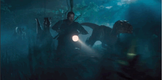
3) The battle effects look good, but maybe you can add more fireworks to make the battles more enjoyable even when you are losing the. I dont know how to describe it better, but if you see this video you will understand what i mean:
Everyone likes big explosions and capital ships that when they fall have a nice slow dramatic animation followed by a massive explosion from their reactors.
At the current phase, the covenant/unsc ships are getting destroyed with a 2 second explosion like they are made from plastic.
As a conclusion of this post I want to say that so far the mod is amazing. Dont make me repeat my gratitude to the people who managed to mix succesfully our beloved haloverse with the soase universe.
The above notes are simply about the visual side of the mod and nothing more. It has nothing to do with the halo lore but with the experience of the gamers.


